Wallpaper: WDD Summer 2021

Summer 2021 Wallpaper Preview.png

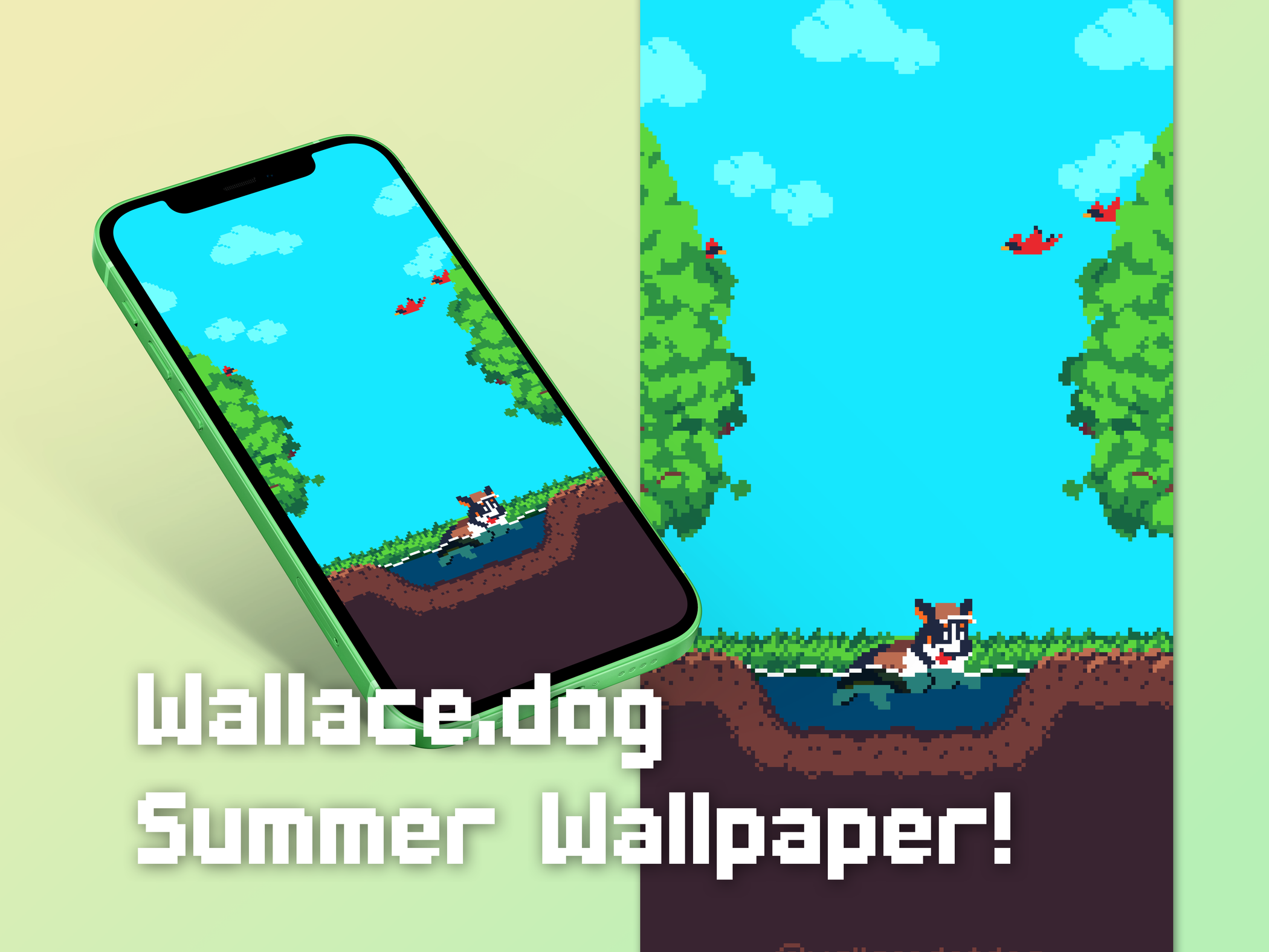
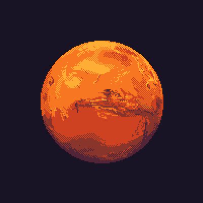
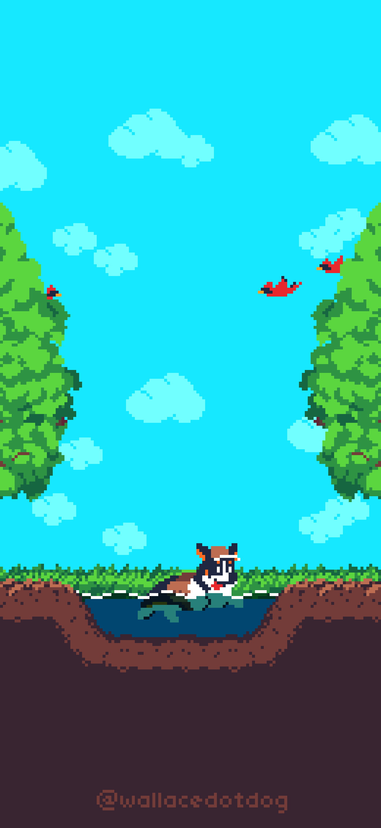
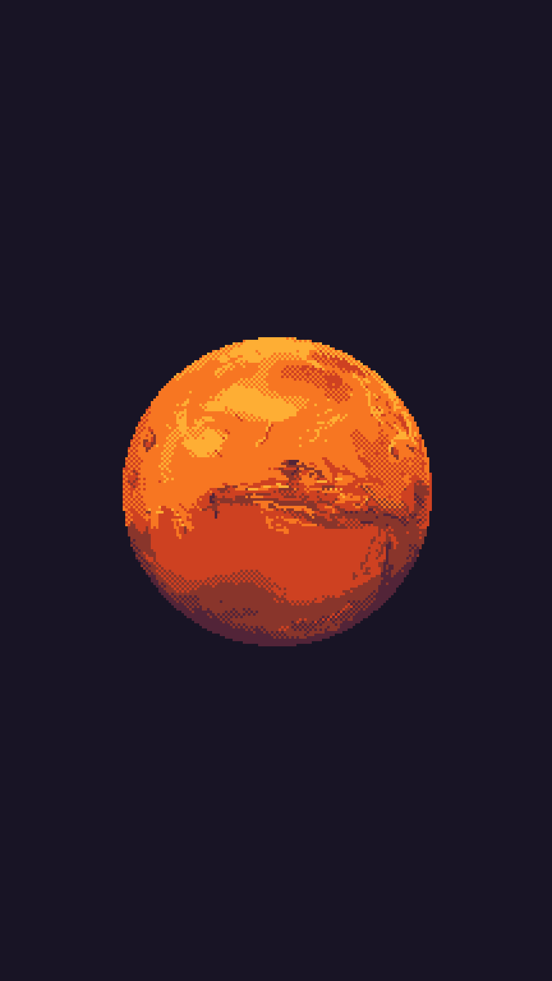
Hey everyone—I hope your summers are off to a great start! My summer is off to a great start, and I wanted to punctuate with a vibrant new wallpaper for my phone. If you want to use it for your devices, I've attached it to this post. Feel free to message me if you need any adjustments for your device!

If you like my wallpapers or work in general, please consider supporting on Patreon!

Etsy Purchases, Spring 2021

Crawdad Leather Charm (link)

crawdad-charm.png

Link. To complement my Crawdad Corgi wall art. The color may be less vibrant than its product photo suggested, but it’s perfect all the same

AirPods Max Stand (link)

IMG_0670.png

Link. A 3D printed stand that looks decent enough. The seller did a good job matching the color of the product. It has magnets that activate the AirPods Max Deep Sleep mode, and is overall less obnoxious than using the “smart case” that came with the headphones. The seller also makes versions that will wirelessly charge the headphones, while requiring both an adapter for the headphones and plugging the stand in.

NEPA Tech Presentation: Become a Google Docs Jedi

My fourth presentation for NEPA Tech. In this 1-hour presentation with 25+ attendees, I demonstrated features that are useful and easy-to-use—yet often unused—features of Google Docs, Google Sheets, and Google Slides. This was followed by a lengthier-than-usual question and answer session. Crucially, I donned a Jedi cloak throughout a majority the session.

The reason for the Star Wars theming: the presentation was given on May 4th.

See the spreadsheet: Sheets Jedi

Video forthcoming: The session was recorded by the event hosts, but the video is not yet published.

jeremy-jedi-garb.jpeg

Some screenshots of Jedi tricks in action:

A dynamic Gantt Chart that updates based on user input.

A dynamic Gantt Chart that updates based on user input.

Melons, à la “A Link to the Past” (2019)

I animated this, frame by frame, from September 2019 to November 2019. It required a slow and measured pace, but was very fun to complete.

It’s based on the title screen for the Super Nintendo classic The Legend of Zelda: A Link to the Past. This was a commission for a friend’s project which was inspired by this post on the r/OddlySatisfying subreddit. Done entirely in Aseprite.

Don’t ask about her melons.

Don’t ask about her melons.

View with sound on YouTube:

Behind the Scenes

Full process, condensed to 20 minutes.

Referencing elements from the Link to the Past animation to my Watermelon redux in-progress.

Referencing elements from the Link to the Past animation to my Watermelon redux in-progress.

NEPA Tech Presentation: From Zero to Hero

My presentation for NEPA Tech, recorded September 24, 2019, where I talk about starting Wallace.dog, getting into pixel art, and getting over excuses. This was fun to make and present, as I used a lot of animation and interaction with the slides throughout.

Introducing Wallace.dog with a treat! View Wallace’s intro with sound at time marker 10:27

Introducing Wallace.dog with a treat! View Wallace’s intro with sound at time marker 10:27

Select Moments

During the presentation, I gave an overview of myself as an artist and designer, then did an overview of my major project—Wallace.dog—that showcased my best animations up to that point. For the main portion of my presentation, I dove into the special rules-based approach that I used to get started with pixel art and animation.

Select Slides

Samsung's Galaxy Marketing Strategy

The spirit of Samsung Galaxy advertising: "We sell iPhones without the Apple logo, while adding / keeping features you love! We sell better iPhones!" A good short-term marketing strategy, but it's definitely not born from a place of passion or a grander vision like the iPhone (or the iPhone's predecessors, the iPod and the Mac).

Samsung's Galaxy marketing strategy in one image. My “blast processing” comment is an unfair jab at the Sega Genesis’s marketing campaign—unfair because, unlike Samsung, Sega’s ads did an amazing job of contrasting themselves against their rival’s competing product, the Super Nintendo.

Samsung's Galaxy marketing strategy in one image. My “blast processing” comment is an unfair jab at the Sega Genesis’s marketing campaign—unfair because, unlike Samsung, Sega’s ads did an amazing job of contrasting themselves against their rival’s competing product, the Super Nintendo.

I'm sure Samsung has its share of passionate designers, but I assume their marketing department is entirely cynical business people who outsource to any design firm that will make their Galaxy ads look like iPhone ads. Compare the latest Galaxy Note 9 web page with any iPhone web page, or look at their latest video ads, which take place in an Apple store.

(I'm not saying Samsung doesn't sell decent hardware, although I have many bones to pick with their software).

Comparison screen grabs (taken from the official product web pages of both the Samsung Galaxy S9 and the Apple iPhone X)

CGPGrey Audition Video

Audio belongs to CGP Grey. My audition animation video for Youtuber CGP Grey's call for an illustrator / animator. The application called for the creation of a video in Grey's style using audio provided by Grey himself.

My audition animation video for Youtuber CGPGrey's call for an illustrator / animator. The application called for the creation of a video in Grey's style using audio provided by Grey himself. 

From the application posting on cgpgrey.com: 


More info at: http://www.cgpgrey.com/blog/looking-for-freelance-help-with-cgpgrey-animations You might also want to listen to https://www.relay.fm/cortex/28 to know what you're getting into.

"If you are interested in working with the CGPGrey channel a full job description can be found here. To be eligible your application must include:
  1. A private dropbox link to a 4k60FPS version of the animated script above. Videos that are publicly posted on YouTube are disqualified. 
    • The animation will contain zero stock images and zero screen grabs from the CGPGrey YouTube channel. All assets will be original.
  2. A ZIP file of the original assets created to make the animation. 
  3. A declaration that you are of legal age to do freelance work. 
  4. No personal information about you other than the city where you live. If you have a portfolio of other work that you want to share, that can be included.
Applications will begin to be evaluated on Friday May 13th."

I used Adobe Premiere Pro CC 2015 to edit the video together, although looking back Keynote might've worked equally well. I've since received an email from Grey's personal assistant telling me that another candidate was chosen.

Alternote

EDIT June 9, 2019: Alternote seems to have been abandoned by its developers for at least 2 years now.

I downloaded Alternote today. As the name suggests, it's an alternate interface for Evernote on Mac (and eventually iOS). It makes the interface a bit more like Notes.app for Mac but with added functionality.

Rundown

Good:

  • Performance is good (when it’s not crashing), though I have a library that's less than 1000 notes and with a fair amount of images.

  • More useful shortcuts than either Evernote or Notes. Particularly useful is Alternote's version of "Jump to…," where it matches for all types of data instead of just Notebooks (and does so quickly in my case).

  • Alternote’s interface is just about 100% what Evernote’s should be, especially on Mac (and probably even with newer versions of Windows at this point).

  • Importantly, it omits or hides the many "features" Evernote has added to their desktop application over the years.

Not Good:

  • It crashes somewhat frequently. It hasn’t crashed for me in the middle of typing or modifying a note, but it’s still disconcerting. As a *guess,* I think it has to do with synchronization after inserting a series of images.

A few nit-picks: 

  • Images can't be pasted into Alternote form the clipboard, where they can in Evernote.

  • I can't seem to drag in more than one image at a time.

  • Alternote doesn't fit previously imported images to window width, so I have to horizontally scroll in places with large images (where before I took for granted Evernote would scale them). Interestingly, it *does* scale images that were imported using Alternote according to window size.

  • It doesn't have a standard help menu. As in, I can't use the help menu to search for menu items. I have a workaround using an Alfred Workflow, but using the help search as a sort of Spotlight for menu items is pretty much ingrained in me on Mac.

  • There doesn't seem to be a way to change the default font.

  • There doesn't seem to be a way to open multiple windows. For example, with Evernote, I liked having my main window open for whatever I was working on and a separate window with my Ideas note open for fast capture of thoughts.

Other notes:

  • Formatting in general is less accessible. I don't mind this, as I'll take hidden (menubar or shortcut) functionality over buttons all over my interface, but I can see how this could be a major negative for some users.

Verdict

It's clean, and it's generally nice to use. What's good is great, and what's not is tolerable.* I give a lot of credit to the developer so far for undertaking what seems like an ambitious project and doing an exceptional job, especially on the interface. It seems like it's being actively developed, so I'm hopeful that what issues exist will be worked out over time.

*Tolerable is a good one-word description of my thoughts about Evernote's interface.